Autocomplete search is a commonly used feature in modern web applications. In this tutorial, you will learn how to build an autocomplete search feature in React using the react-autosuggest library.
Prerequisites:
- Basic knowledge of React
- Node.js installed on your computer
- NPM or Yarn installed on your computer
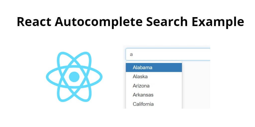
React Autocomplete Search Tutorial Example
Use the following steps to implement autocomplete search in react js applications; as follows:
- Step 1 – Create React App
- Step 2 – Install Bootstrap 4
- Step 3 – Install react-autocomplete
- Step 4 – Creating the Autocomplete component
- Step 5 – Using the Autocomplete component
Step 1 – Create React App
In this step, open your terminal and execute the following command on your terminal to create a new react app:
npx create-react-app react-autocomplete-search-example
This will create a new React app in a directory named react-autocomplete-search-example. Once the installation is complete, navigate to the app directory by typing the following command:
npm start
Check out your React app on this URL: localhost:3000
Step 2 – Install Bootstrap 4
In this step, execute the following command to install boostrap 4 library into your react app:
npm install bootstrap --save
Add bootstrap.min.css file in src/App.js file:
import React, { Component } from 'react'

import '../node_modules/bootstrap/dist/css/bootstrap.min.css';

function App() {
  return (
    <div>
      <h2>How to Create Autocomplete in React</h2>
    </div>
  );
}

export default App;
Step 3 – Install react-autocomplete
To use the react-autosuggest library, we need to install it. Open up a terminal in the react-autocomplete-search-example directory and type the following command:
npm install react-autosuggest --save
react-autosuggest is a library that provides an autocomplete search feature for React apps. It includes several methods that can be used to customize the behavior and appearance of the autocomplete component. Here are some of the main methods provided by react-autosuggest:
getSuggestionValue: This method takes a suggestion object as a parameter and returns the string value to be displayed in the input field when the suggestion is selected.renderSuggestion: This method takes a suggestion object as a parameter and returns a React element to render the suggestion in the suggestion list.onSuggestionsFetchRequested: This method is called when the user types in the input field and triggers a fetch of suggestions based on the input value.onSuggestionsClearRequested: This method is called when the input field is cleared and clears the suggestion list.shouldRenderSuggestions: This method takes an input value and a list of suggestions and returns a boolean indicating whether the suggestion list should be rendered based on the input value and the suggestions.getSectionSuggestions: This method takes a section object and returns an array of suggestions for that section.renderSectionTitle: This method takes a section object and returns a React element to render the section title.onSuggestionSelected: This method is called when a suggestion is selected and can be used to perform an action based on the selected suggestion.
By using these methods, developers can customize the behavior and appearance of the react-autosuggest component to fit the needs of their specific use case.
Step 4 – Creating the Autocomplete component
Next, you need to create a new component that will handle the autocomplete functionality. Create a new file named Autocomplete.js in the src directory and add the following code:
import React, { Component } from 'react';
import Autosuggest from 'react-autosuggest';

class Autocomplete extends Component {
  constructor(props) {
    super(props);

    this.state = {
      value: '',
      suggestions: []
    };
  }

  onChange = (event, { newValue }) => {
    this.setState({
      value: newValue
    });
  };

  onSuggestionsFetchRequested = ({ value }) => {
    const suggestions = this.getSuggestions(value);

    this.setState({
      suggestions: suggestions
    });
  };

  onSuggestionsClearRequested = () => {
    this.setState({
      suggestions: []
    });
  };

  getSuggestions = (value) => {
    const inputValue = value.trim().toLowerCase();
    const inputLength = inputValue.length;

    return inputLength === 0 ? [] : this.props.options.filter(option =>
      option.toLowerCase().slice(0, inputLength) === inputValue
    );
  };

  getSuggestionValue = suggestion => suggestion;

  renderSuggestion = suggestion => (
    <div>
      {suggestion}
    </div>
  );

  render() {
    const { value, suggestions } = this.state;

    const inputProps = {
      placeholder: this.props.placeholder,
      value,
      onChange: this.onChange
    };

    return (
      <Autosuggest
        suggestions={suggestions}
        onSuggestionsFetchRequested={this.onSuggestionsFetchRequested}
        onSuggestionsClearRequested={this.onSuggestionsClearRequested}
        getSuggestionValue={this.getSuggestionValue}
        renderSuggestion={this.renderSuggestion}
        inputProps={inputProps}
      />
    );
  }
}

export default Autocomplete;
The Autocomplete component is a React component that uses the react-autosuggest library to implement an autocomplete search feature. The component has a constructor that initializes the state with an empty value and an empty array of suggestions.
The onChange method is called whenever the input value changes, and it updates the component’s state with the new value. The onSuggestionsFetchRequested method is called whenever the user types in the input field, and it filters the list of options based on the user’s input. The onSuggestionsClearRequested method is called when the input field is cleared, and it sets the suggestions to an empty array.
The getSuggestions method takes a value and filters the options array based on the input value. It returns an array of suggestions that match the input value. The getSuggestionValue method takes a suggestion and returns the value of the suggestion. The renderSuggestion method takes a suggestion and returns a React element to render the suggestion.
Finally, the Autocomplete component renders an Autosuggest component from the react-autosuggest library, passing in the suggestions, input props, and rendering methods as props. The options array and placeholder are passed in as props from the parent component.
Step 5 – Using the Autocomplete component
Now that you have created the Autocomplete component, you can use it in our app. In the App.js file, add the following code:
import React, { Component } from 'react';
import Autocomplete from './Autocomplete';

class App extends Component {
  constructor(props) {
    super(props);

    this.state = {
      options: [
        'React',
        'Angular',
        'Vue',
        'Ember',
        'Backbone'
      ]
    };
  }

  render() {
    return (
      <div>
        <Autocomplete options={this.state.options} placeholder="Type 'r', 'a', 'v', 'e', or 'b'" />
      </div>
    );
  }
}

export default App;
In this code, you import the Autocomplete component and create a new App component. The App component has a state that contains an array of options. We pass the options and a placeholder as props to the Autocomplete component.
Conclusion
In this tutorial, you learned how to implement an autocomplete search feature in a React app using the react-autosuggest library. We started by installing the necessary packages, and then you created a new Autocomplete component that uses the library to provide suggestions based on user input.
We added methods to handle input changes, fetching suggestions, and clearing suggestions, and also added methods to filter and render the suggestions. Finally, we demonstrated how to use the Autocomplete component in a parent component by passing in the options array and placeholder as props.
Autocomplete search features can greatly improve user experience and make it easier to find relevant information quickly. By using a library like react-autosuggest, you can easily add this functionality to our React apps with minimal code.